Last summer, I wrote a review of the first release of Visual Supply Company's fantastic VSCO Cam app, so I thought I'd follow up with a review of the newly released - and newly free (with-in-app-purchases) VSCO Cam™ app.
Apologies in advance for the length of this review - I know I got a little wordy here. The fact is, every time I was about to wrap this up, I thought of something else to say, which should be an indication of the depth of this seemingly simple app. And in case you hadn't figured it out by now, I'm a huge fan. There are still some interface quirks, but in many ways, the app is a substantial improvement over the original, and for the first time, something other than Camera+ has taken the number one spot in my iPhone's dock.
The camera view in VSCO Cam, with the square guide and split focus and exposure reticules.
Shooting
Shooting is pretty standard in VSCO Cam. Like the original app, it's designed for shooting images in succession, and editing them after the fact, as opposed to apps like Instagram, which force you to shoot, then edit and share before being able to shoot again.
New in this version of the app are advanced shooting modes. Tapping anywhere on the screen with two fingers splits the focus reticule into distinct focus and exposure locks, as is possible in apps like Camera+. Double-tap on the screen to re-unite the two reticules.
The shutter is triggered by tapping anywhere within the grey area surrounding the camera icon (other than the thumbnail of the most recent image, which opens up the app's photo library). If that's not a big enough target, there's also a button in the camera settings that toggles "big button" mode, allowing you to tap anywhere on entire screen to trigger the shutter.
There are a few other nice additions to the camera settings: on-screen guides that divide the screen into the either the standard rule-of-thirds grid, or into a square composition, which is nice for previewing how your image is going to look on Instagram.
There's also a low-light setting, which, when enabled, allows the app to take advantage of the iPhone 5's high ISO mode, and a button to enable the use of the LED flash. Finally, there's a white balance lock that lets you lock in the white balance of your subject, then recompose and shoot.
I noticed an intermittent bug when shooting where the photo sometimes gets auto-rotated to landscape mode. I couldn't reliably reproduce that bug, but it seems like it may have been occurring if the iPhone was tilted forward beyond a certain angle. Hopefully, this is something that gets fixed in an update.
Editing
The presets in VSCO Cam are what set it apart from the multitude of other camera apps out there. This makes sense, because the careful emulation of classic film looks is literally Visual Supply Company's bread and butter, in the form of their flagship VSCO Film presets for Aperture and Lightroom.
The new version of the mobile app sports a very nice, diverse selection of free presets that many users could be perfectly happy with. Those seeking a greater variety of looks, however, can tap over to the new store, where a wealth of additional preset bundles, which are available via in-app purchase, for the very reasonable sum of .99¢ per bundle. The store is nicely presented, too - each bundle has a very useful descriptions of the of the types of images they're best suited to, as well as sample images which illustrate the look of each preset. This is a huge improvement over the trial-and-error approach of the previous incarnation of the app.
There are currently a total of 48 presets; they can be filtered by category, such as "black & white", "portrait" or "vivid"; or alternatively, they can be sorted by "popular" and "recent", making them easier to browse through and pick from.
To get to edit mode, tap the edit icon - it's the one with the little paintbrush and wrench on (or double-tap a photo's thumbnail). This brings up the preset menu (don't forget to swipe from the right to see additional presets, which could be easy to miss). Each preset's button now shows a tiny preview of what the effect will look like on your photo.
Slide up from the bottom of the screen, or tap the little arrow below the presets, to reveal additional editing options. Tapping on the wrench icon brings up the Toolkit, which allows you to do things like color-correct, crop, sharpen, tint, add a vignette, and adjust shadows and highlights; while tapping on the paintbrush icon brings you back to the presets. Tapping the third icon repeatedly steps backwards through the edits that have been made to the photo in the current edit session (that is, before you hit the Done button), and the last button is the "bring me back to the original photo" button, aka the nuclear option.
One of my issues with the original app was that it took forever to export full-resolution images to the camera roll. Well, there's good and bad news on that front. The good news, I'm happy to say, is that there have been exponential performance improvements in this version of the app - saving to the camera roll is blazing fast, as is sharing to the various social sites like Instagram, Facebook, Twitter and Weibo (another great feature: you can choose which of these services show up in the Sharing menu via an option in the app's preferences). The bad news is that I experienced several nasty crashes requiring a hard reset of my iPhone when epxporting more than a handful of photos at a time - another issue which will hopefully be addressed soon.
Using the App
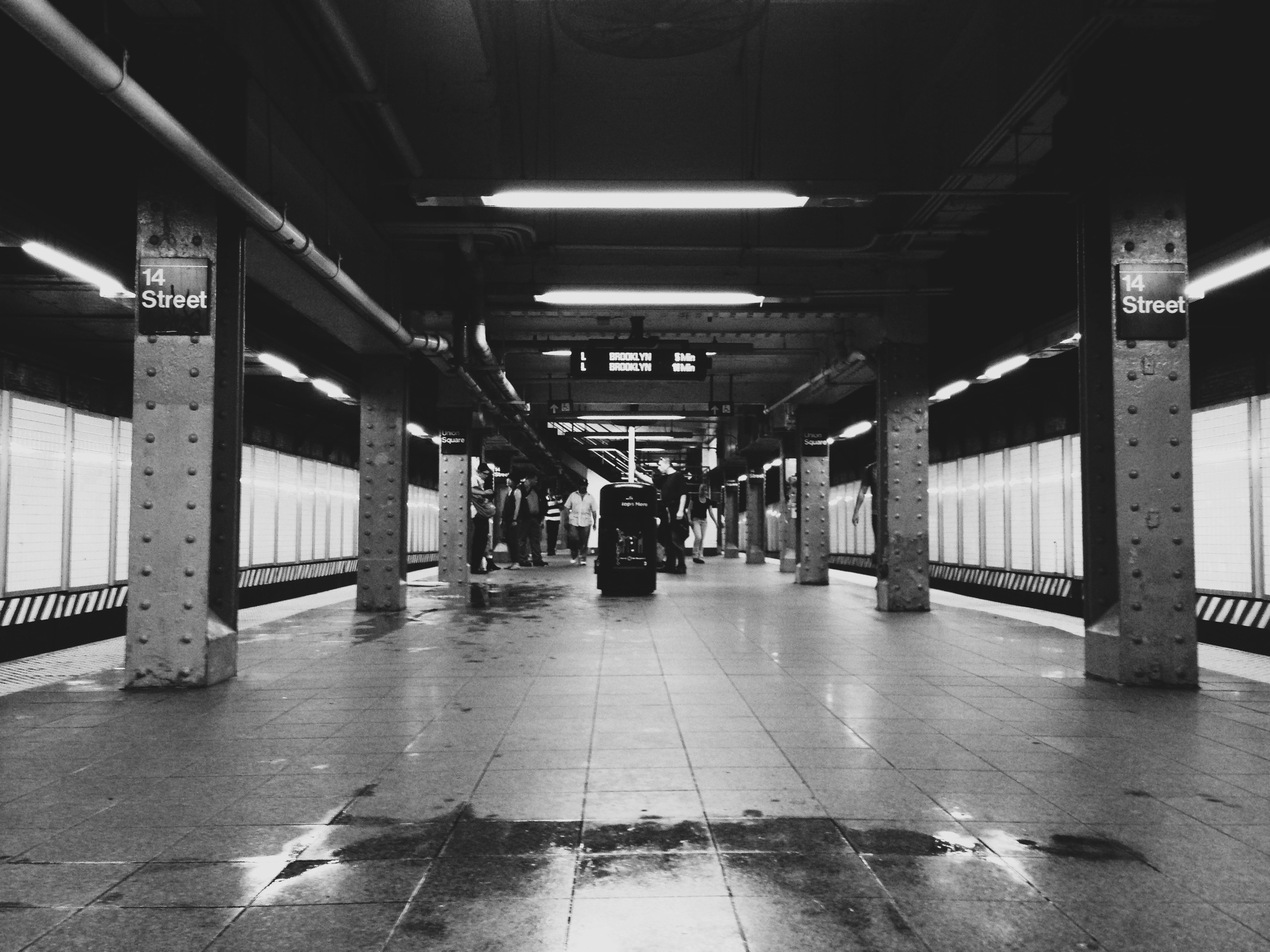
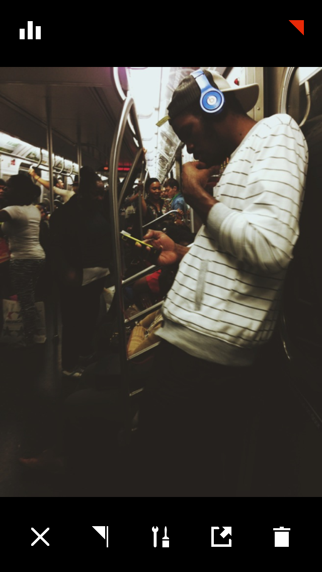
Using the app is a lot of fun. As I was taking notes for this review on the subway, I actually spotted a fellow passenger using the app, and when I asked him about his impressions, he said he was obsessed - he just couldn't stop playing with it. And a woman on the train who overheard us gushing about it later tapped me and asked me for the name of the app and downloaded it on the spot as soon as the train emerged from the tunnel and cellular service returned.
In addition to the beautiful presets at the heart of VSCO Cam, the numerous other details, like the ability to rearrange your presets, or to set your preferred licensing options for your photos (all rights reserved, or creative commons) are a testament to the thought the developers put into this offering. Then there are the filtering options for your Library - tap to display only edited or flagged images. (It would have been nice to have a "not edited" or an "exported" option as well.) Finally, there's the Discover section, which is full of videos, articles, and tutorials for inspiration.
The app's only (minor) drawback might be its interface. It looks really nice, and you can tell that a lot of thought went into the visual design of the user interface elements. However, those pretty icons take a little getting used to, since they don't look like the standard camera app icons we're all familiar with. And though the mini previews that accompany each preset button are definitely appreciated, the color-coding within each bundle of presets seem a tiny bit arbitrary, and doesn't give any indication of what you might want to use those presets for. Also, from editing mode, it takes at least three taps to get back to camera mode - it would be nice to have a faster way to get shooting again.
It also took a little while for me to remember that the X icons are used for returning to previous menus, rather than for deleting images. Then again, when an image is selected in the Library, a trashcan icon (that does delete the selected image or images) appears right where the camera icon used to be. That could be seen as poor interface design (or I could just slow down a little when using the app).
Again, I consider these drawbacks to be fairly minor, after a week of using the app, I've already pretty much gotten over them.
VSCO Grid
One of the biggest and most ambitious new features added to VSCO Cam is no less than a publishing platform. That's right - the good people at Visual Supply Company had the gumption to develop a "minimalist publishing platform", as they describe it, and toss it in along with the new version of their app. They state pretty clearly that they're not trying to be a new Instagram (in fact they actively encourage sharing to that platform). Instead, VSCO Grid is a stripped-down venue for curating, publishing and discovering beautiful photography. It's not available to everyone right away (in fact, I'm still compulsively checking my email for my activation notice), since they're still working on ensuring that the platform will scale properly with heavy usage.
Conclusion
My minor gripes aside, there's a whole lot to like about this app. It's available for iOS only, and there's currently a huge launch sale on all of the 48 of the available presets for $5.99 (which is around 70% off of the price you'd pay if you bought each bundle separately). Additionally, if you were a user of the original VSCO Cam app, and you ran the last available update of that app, you got a nice little gift of the original presets for use in the new version of the app.
Get it now; highly recommended.
